Monday 28 March 2011

Task 5 - summary of 'Thinking with Type' & Deconstruction

 Allen Hori - 'Typography as discourse poster' - 1989
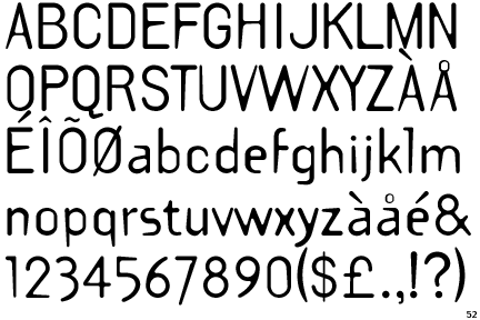
webdesignstuff.co.uk

From reading Ellen Lupton’s writings, (‘Thinking with type’, 2008, pp.87-100), it is clear that deconstruction as a theory is one of great complexity, containing many underlying theories on how text can be constructed to portray meaning and change a texts ‘tone of voice’. The theory of deconstruction was first devised by French philosopher Jacques Derrida in the 1960s, and in short, is an approach to text which aims to analyse the systems of representation used when writing and the surrounding systems that frame their communication.

Deconstruction looks at examining the relationship between speech as the primary method of communication and writing as the secondary. This is based on writing being once removed, so it is not a direct response to a person, it also requires learning and equipment to achieve. Whereas speech is a direct form of communication that gains meaning from its delivery and the way in which it is formed during spontaneous conversation.

Deconstructivist designers look at the written word as equal to, if not more important than speech in conveying meaning. This is down to the role of typography and the designer, in the creation and implementation of meaning within the text itself.

A conventional typographic layout would emphasize the completeness of a work and its authority as a finished product. Alternative design reflects how the meaning originally intended by the author can often be lost through the design of the page in order to help the flow of information. Deconsturctivist designers such as Katherine McCoy use a text to challenge the reader in producing their own meaning and finding their way through the text.

Ellen Lupton’s text also outlines how designers generally treat a body of text the same throughout a document as this gives it the feeling of being coherent and evenly distributed across a document. A designer then uses their knowledge of how texts are taken in to help the reader navigate through long bodies of writing whether this be through the use of paragraphs, indents, or when working digitally, hyperlinked text. It is seen as the job of a designer to utilise typography in order to help the reader navigate the flow of content, however Lupton (‘Thinking with type’, 2008, pp.87) writes, “one of design’s most humane functions is, in actuality, to help readers avoid reading”

French critic Roland Barthes like Derrida looked in great detail at typography’s role in creating meaning and looked at the idea that while talking is a form of communication that flows in a single direction, writing occupies an element of space as well as time.  Therefore written text can be used spatially to portray various meanings and give a text a whole dimension in the way it is read, which can’t be used in the same way through speech. This is backed up by this quote from Barthes(“from Work to Text”, 1971). “A text…is a multi-dimensional space in which a variety of writings, blend and clash.”

The theories of deconstruction are then reflected in deconstructivist design as a critique of design conventions, by using these agreed typographic conventions differently. Which I think is summarised in the image that I have chosen to analyse, Allen Hori's, 'Typography as discourse' poster. I really like this poster however it is evident that everything to do with the flow of content and user friendliness from the  writings above have been dropped in order to help the reader create their own meaning from the text on the poster. There is no hierarchy of information as text is placed in what looks like a totally random configuration in various point sizes, fonts, directions and orientations around the poster. It is clear from the way that the text is placed, there is not supposed to be a defined way of reading this, information is picked through as the reader discovers it.

There is also a clear use of image in this poster, and an element that the text has been placed in a composition that would be more visually engaging than logical. Again this would appear to be an attempt at making the reader build meanings but also to elevate the designer within the process of authorship. As Lupton writes that deconstruction('Thinking with type', 2008, pp.97), "Imploded the traditional dichotomy between seeing and reading. Pictures can be read and words can be seen" This places value within design on ambiguity and complexity over legibility and flow of information.


Sunday 27 March 2011

Task 5 - post-modernist graphic design

Jamie Reid - Never Mind the Bollocks - 1977
 Musichistorytour.blogspot.com
 This is the cover for 'Never mind the bollocks' by the sex pistols. I think this could be considered post modern because of the evident anti-aesthetic, anti-technique and critique on the modern world.
 James Rosenquist - Marilyn Monroe - 1962
www.flikr.com/photos/wallyg
This is a piece by James Rosenquist from the Pop art era. I really like his work, and although not strictly graphic design it has a very graphically based aesthetic and makes use frequently of recognised graphics. Pop art was a post modernist movement as it made fun of art society and used a retro aesthetic.
 Scher, P - 'Swatch Watch USA' - 1984 and Herbert Matter's original.
mavericked.com/tag/snow
This is an advert for swatch watches that show some very clear post modernist qualities. The main one being the direct imitation of Herbert Matters original poster and almost exact same composition. With the belief that everything has already been done, so why not just copy...
 Raoul Hausmann - ABCD - 1923
designhapiness09.blogspot.com
Another piece showing postmodernisms trademark anti-aesthetic and attempt at showing poor technique on purpose.
Stefan Sagemeister - 'Hurry'
Melissa-tampin.blogspot.com
Another example of a piece showing a strong anti-aesthetic and anti technique. It is clearly a piece that goes against defined conventions of design.

Monday 21 March 2011

Deconstruction.

Jacques Derrida
analysing function of typography & writing.


Postmodernism 
-questioning/reframing ideas from a modern world.
-attack on modernism

POSTMODERN
Jamie Reed - sex pistols - never mind the bollocks.

-Anti-aesthetic.
-anti-technique
-critiques the modern world.


DECONSTRUCTION - style of design & architecture.
deconstructivism - Not deconstructionism
big in 80s & 90s graphic design
became know widely as De-con.
played with ideas of graphic design

Cranbrook Academy , USA not, style approach
'of grammatology'
more of a question
-analysis
-kind of philosophy.
-approach to text which analyses the system of representation & surrounding systems which frame their communication. 

'us or them'
speech - primary method of communication.
writing - secondary method of communication.
 writing is once removed...
-requires learning
-equipment
-absent subject.

Subject is constructed in your head..?
writing carries on after person does, where as speech doesn't have this same potency.

The focus on writing as equal if not more powerful than speech

-simplistic way of looking at writing is that we are reading the authors ideas
-there are a lot of little things that get in the way of this.

Fixed meaning is authoritative
-kills a text

deconstruction is the perfect blend of theory and practice
always more to it!

in some ways - designers voice can be more important/prominent than that of the authors.
typography looks as though there is only one meaning
hand written texts give the appearance that there are a lot more.
not just in the type
but in the spacing between it aswell.

Changing the way texts are read by the way it is designed, altering the flow.
abstract or structured etc.

KATHERINE MCCOY
-reading isn't neutral
-constantly reminded that you are making the meaning.
-meaning is totally created by how the reader sees the text
-reveals the mechanism by which you read

Levi Strauss
Derrida
Barthes
Saussure. thinking of things through structures.

Cranbrook - visible language
'french currents of the letter'
-taking standard academic forms and slowly adapting, to make you aware of the structure.


-destroying the standard idea of the journal & showing the possibilities of created meaning.


ED FELLA
ALLEN HORI
'typography as discourse poster'

No hierarchy of information...
allows the reader to pick their own way through the poster


TEMPLATE GOTHIC
BARRY DECK , 1990


RAY GUN
DAVID CARSON 
 1992-95


Carson the end of print. 
using practice to be theoretical - with the two in dialogue constantly. 


provokes thought
forces you to think about why it has been changed and what has changed. 
forced to read and consider. 
unpicking things that are hidden but affect the way you read. 
 
ARCHITECTURE
Using forms and techniques to critique that form.
DANIEL LIBESKIND
PETER EISENMANN
Assume a building will look a certain way.
So uses normal ideas to critique and make people question.

BERNARD TSCHUMI
need to think your way through his par.

in 3 different ways
Anti-authoritarian

"this is how you will read the book"

deconstruction
"how do I read this book?"

JEWISH MUSEUM - DANIEL LIBESKIND
deconstruction is a process for critiquing assumed conventions from within

By using those conventions differently .


DERRIDA - GLAS
designer Richard eckersley
deconstructs subtly what it is to be a book.


Using graphic design to question what it is & how it creates meaning.

postmodernist aswell